March 31, 2020
10 min Read
The Top 5 Web Design Mistakes to Avoid When Building Your First Website
 Website design mistakes drive your visitors away and can result in huge losses for your business in the Philippines. The worst part is that, despite the fact that an increasing number of tools and platforms (such as WordPress) make it easier to build your website, it's still super easy to commit grave web design mistakes. Even a simple logo design fault can hurt your brand's reputation. And this comes as no surprise as your website is one of the most valuable assets of your business that is critical for your company's online presence. As checking a business' site is one of the most common ways to check an enterprise's credibility, you don't want to make mistakes that will damage your reputation and drive your visitors away. The good news is that building a mistake-free site is absolutely possible. You can achieve that by learning the most common mistakes of website owners as well as tackling them via the use of web design best practices. And, in this article, we'll show you exactly that, listing the top website design mistakes Filipino site owners make as well as some nice tips to help you avoid them.
How Important Is Web Design for Your Business in Philippines?
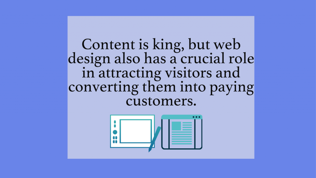 While there's a consensus among marketers in the Philippines and beyond that "content is king," many forget the crucial role of web design in attracting traffic to your website and converting visitors into paying customers. And it makes perfect sense. Would you rather visit a website with a horrible design but the best content you've ever seen or a site with gorgeous design elements but mediocre content? Despite the superior quality content featured on the first site, its clunky design will turn visitors away. On the other hand, visitors will stay on the second website as they are tempted by its flawless, sleek design that helps the business in turning prospects into paying customers. Let us present to you some statistics to support the above-mentioned statements. Adobe's research revealed that 66% of Internet users prefer to read something that is beautifully designed. This number is even higher for younger generations, with 73% of millennials preferring sleek design to something plain and simple. Furthermore, according to a Stanford study, three out of four users judge a business' credibility on web design alone. While an average of 50 milliseconds is enough for visitors to form a first impression of your website design, 38% of people will stop engaging with your site if they find the layout or the content unattractive. We could easily go on with a hundred more stats, which are true for users in the Philippines and other countries as well. But, instead, let's come to the conclusion that web design is crucial for your website and you have to do your best to avoid mistakes in order to provide the best first impression and user experience for your visitors.
The Top Website Design Mistakes That Will Hurt Your Business' Online Presence
 Now that you know how critical web design is for your business let's proceed with exploring the top mistakes website owners make along with our suggestions on how to avoid them.
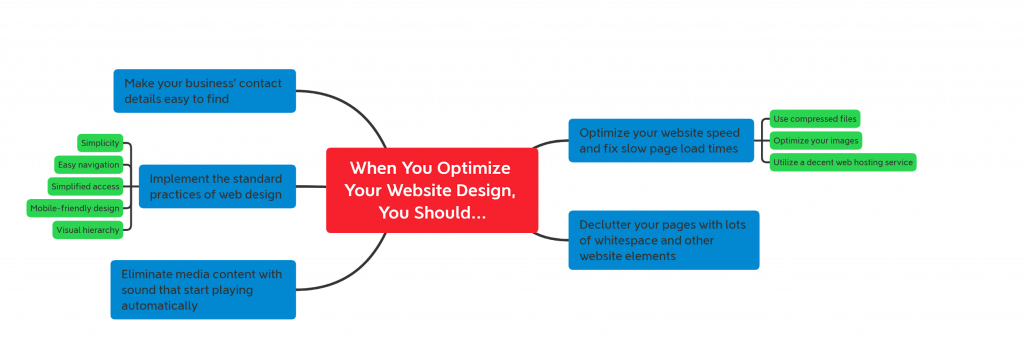
Failing to Implement the Standard Practices of Website Design
After realizing that they need to set up their online presence, many people jump right to build their websites without learning the basic principles of web design. And, we can't emphasize the importance of knowing the basics. Just imagine that you are starting the construction of a house without understanding how to build its base structure. Spoiler alert: the building will collapse, and you'll have to start the construction from scratch (again). And the same rules apply to website design. If you start setting it up without possessing at least a basic knowledge of the best practices, your site will be riddled with mistakes, and you'll eventually have to rebuild it. To avoid rebuilding your website, we've listed the most important principles of modern user experience (UX) design you should remember every time you are dealing with web design:- Simplicity: Like with other elements of life, people tend to overcomplicate things when they are designing their websites. It's a grave mistake as Internet users don't want to complete numerous forms or navigate through multiple welcome pages to get what they want on your website. Simplicity is the key to achieving success with website design, and you should make your site as easy as possible for your visitors to reach their goals.
- Easy navigation: When a visitor arrives on your website, he doesn't want to get confused about where to head next as too much confusion will make him leave your site. To avoid that from happening, you should show your visitors the exact place they have to go on your website by using navigation elements, such as search boxes, breadcrumbs, and internal links.
- Simplified access: An essential element of UX design is to make your website equally accessible, showcasing your gorgeous design on all devices. In addition to creating a responsive design, you should also avoid distracting elements – such as too many pop-up forms and ads – that will turn the attention of your readers away from your main content.
- Mobile-friendly design: According to a report, the majority (52.2%) of Internet traffic came from mobile devices in 2019. Therefore, to suit the needs of smartphone users, you have to make mobile-friendly design one of your top priorities as the lack of a decent responsive website design will turn them away from your site.
- Visual hierarchy: You should not only make navigation easy for users, but it is also essential to show your visitors what specific actions you want them to take on your website. To make this possible, we recommend playing with visual elements in a way to highlight the most important ones from the others. The most common visual hierarchy methods include adjusting the position of the core elements of your site, making them larger than others, and using different colors for them that can be easily noticed by your visitors.
Hard to Find Contact Details
When people want to reach out to your business, they don't want to spend hours to find your contact information. Let's say that you are on the go and you need to reserve a place to meet a client in a hurry. You've just found a quiet restaurant that may seem like the perfect fit, but you can't find the phone number to reserve a table. In this situation, would you turn into Sherlock Holmes to look for clues –while wasting your precious time – or would you rather find another place where the phone number is clearly displayed so you can make your reservation for your meeting ASAP? We don't think too many people would go with the first option (not even Sherlock Holmes himself). They would instead leave your site to find a better alternative that your visitors can contact easily. And believe it or not, this is one of the most common web design mistakes website owners make when building their sites. To fix this issue, make sure to create a dedicated page that clearly displays your contact details so your visitors can reach out to you in a convenient way. And creating this page is not enough; you have to make it visible everywhere on your website by adding the relevant menus and buttons to different parts of your site, such as the header and footer. Pro tip: In general, adding contact details and information about your business will create credibility and give a better first impression to your visitors.Slow Page Load Times
People hate to wait, and as the speed of our lives is getting quicker. Because of the same reason, our society is becoming increasingly impatient. And, unfortunately, this makes perfect sense as spending ten minutes at a grocery checkout line could take precious time away from us. As people hate to wait, you don't want to make them impatient with a slow website since this common mistake could cost your business significant losses. A study has revealed that one in four visitors will leave your website if it takes more than four seconds for a page to load. And this is even worse for mobile users, with 74% of them abandoning your site after waiting five seconds. While five seconds may not seem much at first, it is all it takes to kill your website's traffic. And, in addition to the decreased number of visits, if you are running a slow site, your conversion rates will also suffer (an average of 7% loss according to the same study). Furthermore, a slow website will also hurt your rankings in search engines like Google, as they will penalize you for not meeting their page speed requirements. While the cause of slow page load times could be due to numerous reasons, you should take your time to investigate these issues to optimize the speed of your site and avoid visitors from leaving due to performance-related problems We've listed some common issues that you can investigate to optimize your page load times:- The use of uncompressed files: File compression is becoming the next big thing on the Internet. However, many website owners upload files in their original forms to their sites, which results in increased page load times. Therefore, you should compress your files ruthlessly to ensure the best speed for your website.
- Your images are not optimized: Many believe that images should be used in their original forms. But they are wrong. You should use the practice of optimizing your images to speed up your website while providing your visitors with useful media content.
- Inadequate web hosting service: While there are plenty of methods you can use to optimize your site speed, there are things that are slowing down your website that you can't do too much about. One of these is your web hosting service, as utilizing the solution of a mediocre provider could result in increased page load times. Be sure to be extra careful when you are choosing a hosting solution to avoid page speed issues caused by service providers.
Cluttered Pages With No Whitespace
We get that you want to provide as much information to your visitors as you can, but you should do it in a way that doesn't make your website cluttered. And believe us, if you cram too much information on one page, your visitors will get overwhelmed, and they will click away to find a better alternative to your site. Instead of overwhelming your visitors with too much content, make your pages easy to read by using lots of whitespace between different website elements. The smart use of graphics and concise, easily digestible titles could also help. Pro tip: When you see clutter on your pages, remember the first principle of UX design: simplicity. Now with that in mind, start testing your website and replace the elements that create clutter with whitespace, graphics, and other elements that make your content easy to read.Videos and Music That Start Playing Automatically
Do you know the feeling when you are reading an article on public transport, and a video starts to play suddenly on your phone with a loud noise? We bet that you hate that when it happens. And you can be sure that your visitors don't like this feeling too. Whenever a video or music starts to play on your website, a large part of your prospects will head back to where they have been before visiting your site and never return as they find your automatically-playing media content annoying. While videos and media content with sound (such as podcasts) can provide helpful content for your website, you don't want them to play automatically as it will result in high bounce rates, lower conversions, and a general loss of traffic. Instead, let people decide whether they want to watch a video or listen to some music on your website whenever they feel like. This way, you can stop them from leaving your website while providing valuable media content for your visitors.It's Easy to Make Mistakes, But the Hardest Part Is to Learn from Them
 By nature, humans make mistakes, especially when they are starting out with something new. Because of this reason, it's perfectly okay if you just realized that your site includes one or multiple web design mistakes that we've listed in this article. However, you should learn from your (and others') mistakes and use this knowledge to fix all the web design issues of your website to ensure the best user experience for your visitors in the Philippines and beyond. As a result, they will make you (more) money by turning into paying customers instead of leaving your site to use the services of your competitors. Although, if you want to make sure that your new website is mistake-free, we recommend checking out Z.com’s web design services that are the perfect choice for starter site owners in the Philippines.
PROMO
FREE Web Hosting
for Your Website
Learn More