General
October 21, 2020
13 min Read
How to Create an Awesome Landing Page That Sells [2020]
How to Create an Awesome Landing Page That Sells [2020]
A landing page (that works) converts and sells. It’s one of the most effective marketing and lead generation tools you could ever use for your business, especially if you’re running advertisements and promotions. But how do you create one? Is it something you can do for yourself? The answer is yes. You can definitely create a landing page by yourself. Creating and designing one is just like creating any other page, though there would be more planning involved. Let’s get started!Create buyer personas
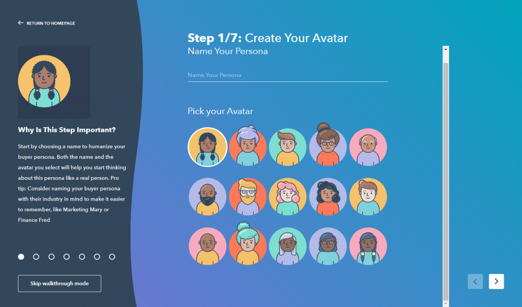
Whether you yourself would write the headline and the copy of your landing page or not, it would be impossible to come up with the right points without knowing who your target customers are. You need to know what they “want” in order for your landing page to work. That’s why before everything else, create your buyer persona first — who your ideal customer is. You may already have a buyer persona for your business, but you need to come up with specific ones that your landing page will be targeting. For starters, you should have the target buyer’s basic characteristics including…- Age
- Location
- Education
- Marital status
- Type of employment
- Income range
- Hobbies and other interests
- Problems
- Habits
- Attitude
 Creating a buyer persona would enable you to attract the right customers. If you’re already running an ad, then you must have a buyer persona already. Make sure that your landing page receives the right buyers from your ads. If you have different sets of ads or variations which target different demographics and psychographics, you should create separate landing pages for each type of customer to maximize the effectiveness of the tool.
Define the desired outcome
After creating your buyer personas, it’s time to iron down the specific purpose of your landing page. The goal of your landing page will heavily influence the headline, message, and the call to action. For example, this landing page from Writing Revolt is designed to convert visitors into watching the free class. Notice here that the outcome was clear from the start.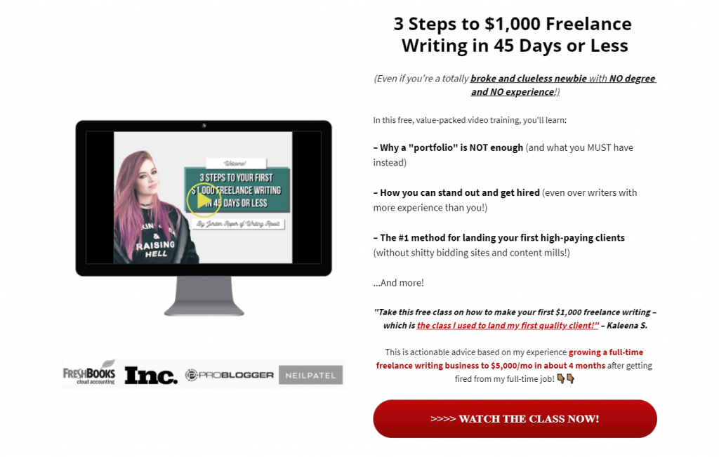 Ask yourself the “conversion” you would like to happen. Should visitors be persuaded to…
- Give away their email address
- Answer a survey or a form
- Download an ebook
- Order a product
- Register for your course
- Sign up for a free trial
- Subscribe to your newsletter
Research the “right” keywords
Strap in… This may get a little bit technical. But basically, you would want to optimize your landing page so people who are using search engines will be able to find the solutions to your problem (via your offer). When they use Google, they will type in words and look for the results. These words are the “keywords”, so to speak. But you won’t be researching just keywords, you need to find the “right keywords” that your target audience will be using. For example, searching for “hardware stores” produces different results than “hardware stores in manila”. To be able to find the right keywords, you have to use keywords tools. Some of the best ones include Ahrefs and SEMrush. However, these tools cost a lot. If you would like to use free ones, you can use Ubersuggest or The Hoth’s free keyword research tool.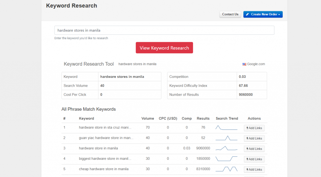 When selecting keywords, it’s always better to focus on specific terms and long-tail keywords. These are usually what determined searchers use. Come up with a list of the right keywords and use one that fits your buyer personas and desired outcome. Now, your landing page may be the target link of your running ads. However, don’t discount the fact that visitors may find your landing page organically, that is, through Google and other search engine platforms.
Use a killer headline
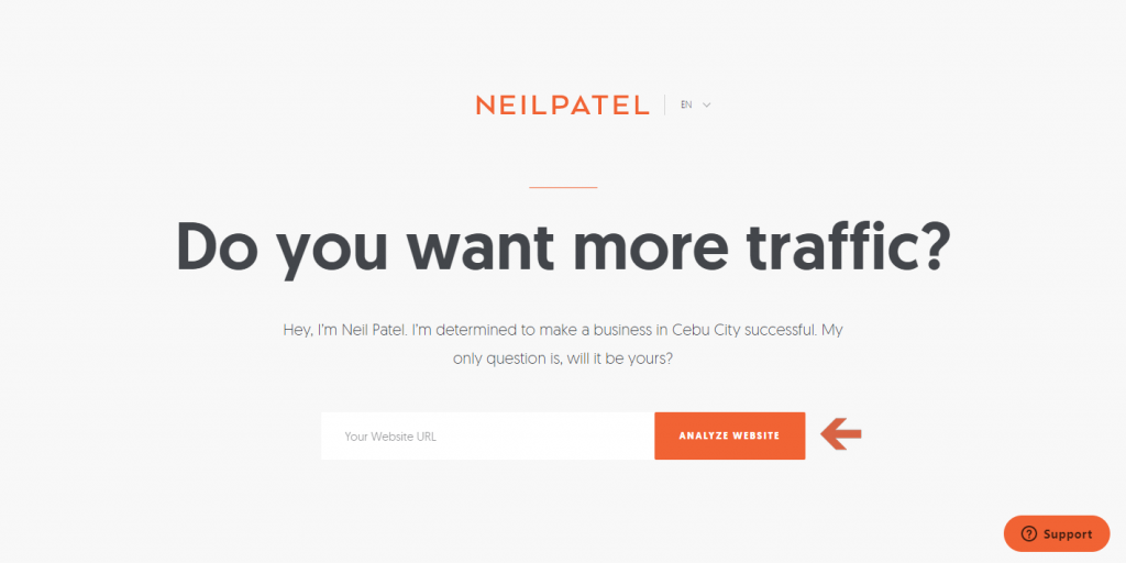
When a visitor gets into a landing page, the first thing they see is the headline. That’s why you only have a second or two to persuade them to stay and learn more — or go back from where they came from. Here’s a statistic from Copyblogger that would make you feel the importance of headlines:“On average, 80% of the people who visit your site will read the headline copy. But only 20% will read the rest.”
But there’s no one-size-fits-all when it comes to headline. But generally, your headline should be able to…- Take hold of the visitor’s attention (you only have a second or two for this).
- Tell the visitor what the landing page is all about.
- Deliver the message to the reader in as few words as possible (never more than twenty words).
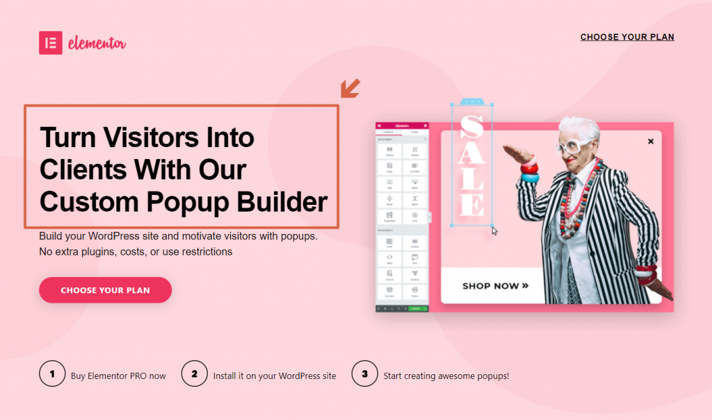 Here’s another awesome example from Diggity Marketing:
  If I was someone who’s looking for a way to increase my website traffic, I would definitely download the three case studies here in a heartbeat. I would’ve done that even without reading the whole copy (since I’m “dying to find a solution” to my problem). Here are some ideas to spice up your headline and make it click-worthy:
- Mention the solution to their problem.
- Make them laugh.
- Include statistics or any empirical evidence.
- Be empathetic.
- Lay down the benefits.
- Don’t be afraid to make a promise (as long as you can keep it).
Backup your headline with a convincing subheader
To make your landing page really effective, pair up your headline with a subheader. Make the first two elements of your page a slippery slope to compel your visitors to slide down the “conversion hole”. Take this example from BigCommerce. The headline does well in making me feel interested in how BigCommerce and Visa can help me with my business. But the subheader explains it well to me.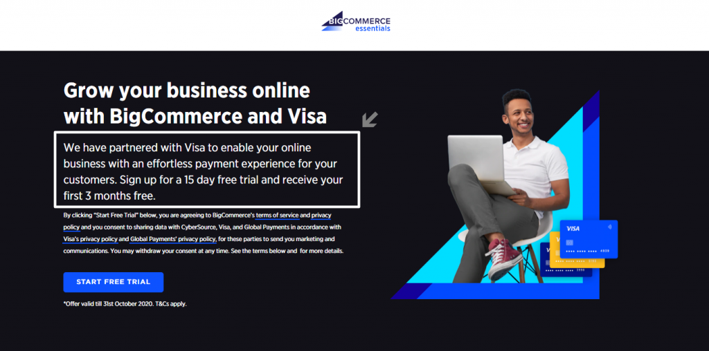 Remember the BigCommerce landing page earlier? Once you scroll down a bit, you will see another subheader with another set of information. Once you scroll down further, you will see the same pattern.
 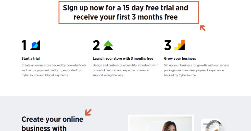 So when you write the marketing copy of your landing page, make sure to use subheaders all throughout the landing page. The same with how the 1-2 punch of headline-subheadline, do the same for the subheadline-copy sections.
Insert as many images as appropriate
You’re probably tired of hearing how a picture is worth a thousand words, so let me use a different, fascinating statistic I took from HubSpot about the use of images…“90% of information transmitted to the brain is visual, and visuals are processed 60,000X faster in the brain than text.”
That’s the reason why you couldn’t see any home page, landing page, or product page with a respectable marketing team that has no pictures in it. In fact, you can hardly find any website nowadays without any sort of visuals. Here’s a perfect example from the popular Harry’s: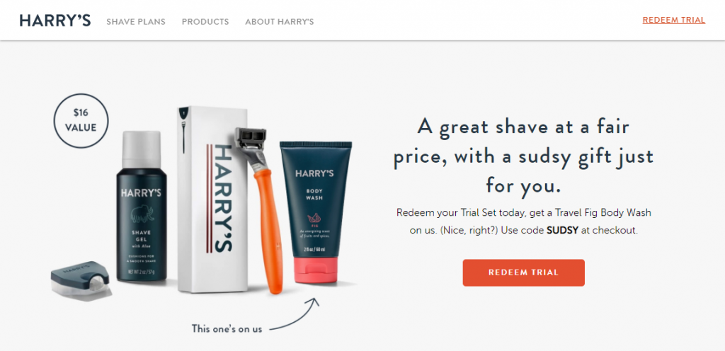 From the image they used, there’s no need for me to tell you what Harry’s is all about and what the main product they’re selling on this landing page. Vooks even took it a notch higher by using a video on their landing page. (Amazingly, this is the first time I’ve heard of Vooks and their landing page really got my attention — as you can see from the almost finished video in the screenshot.)
 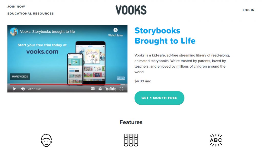 Fair warning: You just can’t use any picture you like. At the very least, your picture or video should be…
- Related to your product or service
- In high-quality (and large, if it looks right)
- Attention-grabber
Don’t hold back on your copy
Unless you’re some kind of marketing god, then a headline-subheadline-image won’t cut it 100% of the time. You would need a nice, compelling copy that would push your visitors into converting. The good news is, writing a good copy is a skill. It can be learned and improved upon. It’s not a walk in the park, but if you put in the right effort, you would be able to pull it off. In addition, there are piles of resources online you could use to compose the best copy possible. Here are a few tips to get started:- Use the AIDA technique (attention - interest - desire - action)
- Clearly explain what your offer is all about.
- Focus more on the benefits — make your visitors “want” your offer.
- Hit the pain points and how your offer would be able to solve their problems.
- Resonate with an emotional need of your visitors and sell them the dream.
- Dedicate a frequently asked questions (FAQ) section.
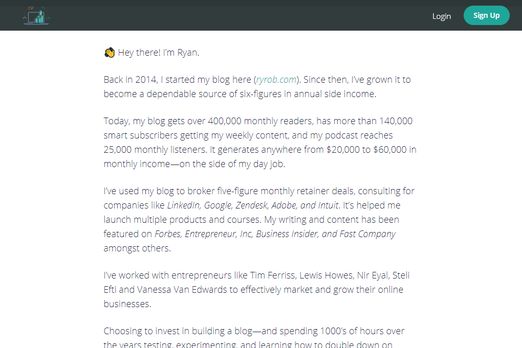 In addition, he also has an FAQ section further down the page…
 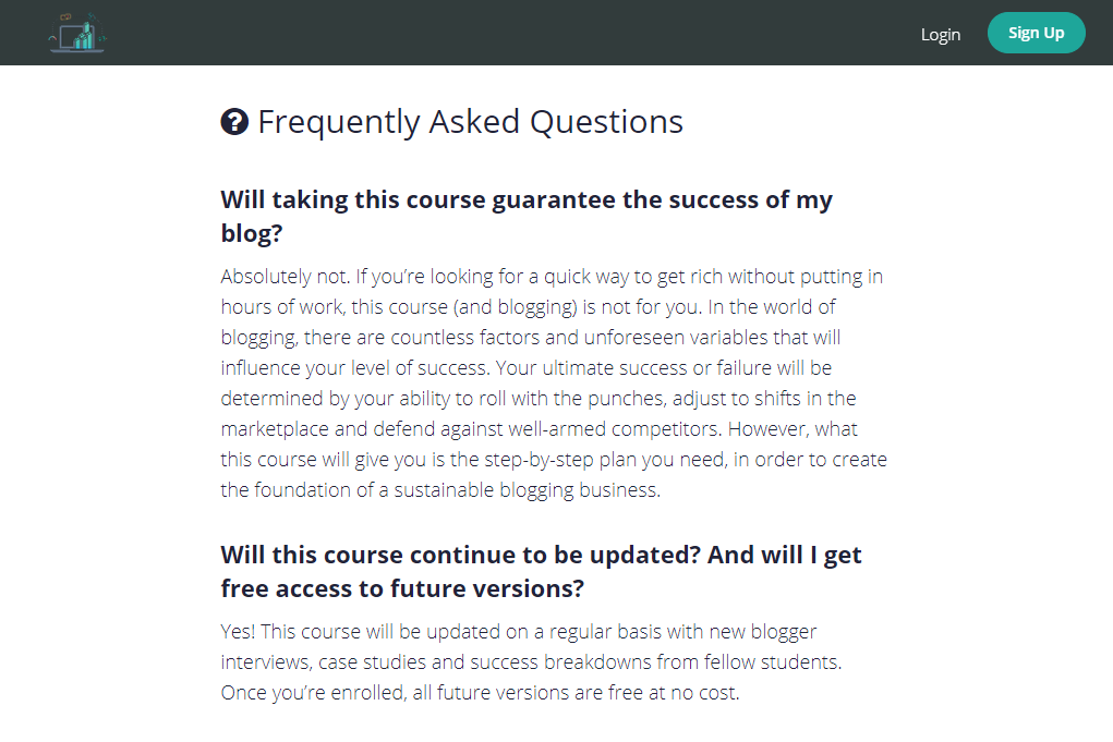 If you don’t feel like writing a good copy, you can always hire a copywriter for a few thousand pesos. There are a lot of them on Upwork and Fiverr that could help you create a better copy for your landing page.
Show your visitors what other people say
After putting in a nice, compelling copy, it’s time to put the cherry-on-top: testimonials and social proof. Why? Because your visitors would like to know what “other people” think about your offer. They want some sort of social validation on your offer. One time, Zendesk held an online survey of more than a thousand consumers who received online and phone customer service. Here’s one of the things they found out…“Majority of the respondents, at about 90%, who recalled reading online reviews claimed that positive online reviews influenced buying decisions, while 86 percent said buying decisions were influenced by negative online reviews.”
That’s why Ryan (from the example earlier) put testimonials on the landing page.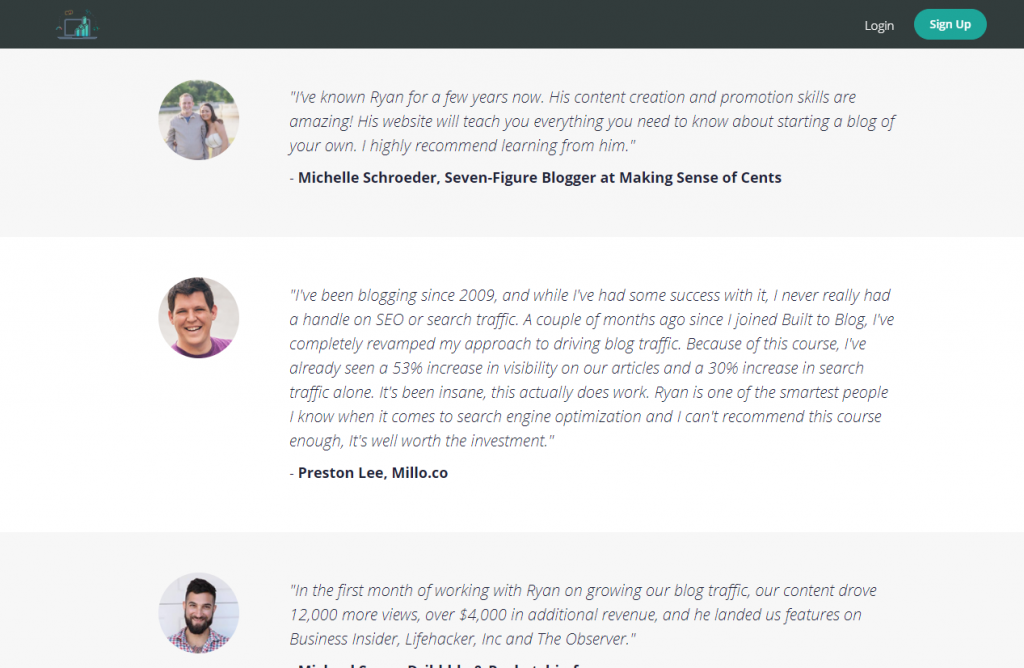 The same goes for Brian Dean’s landing page of his SEO training course:
 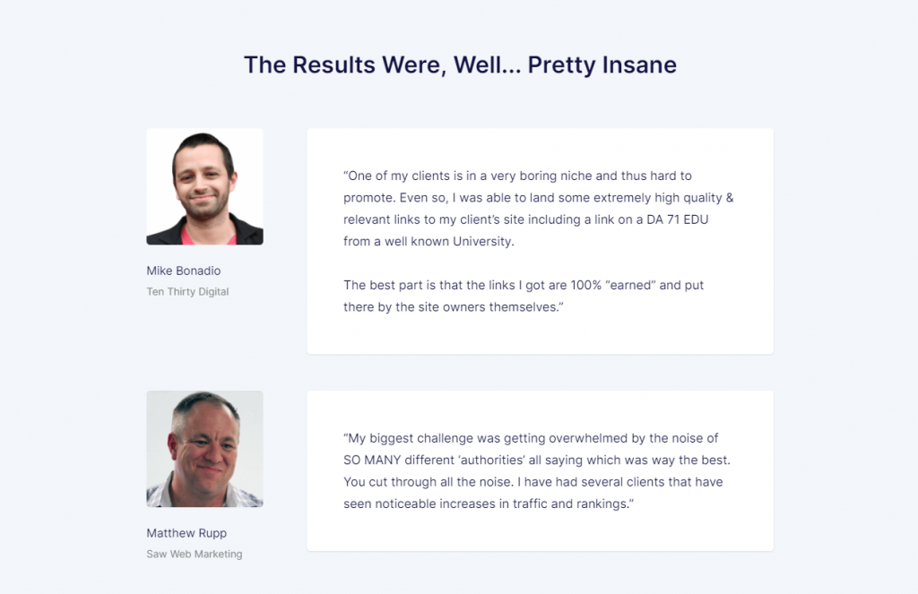 Notice that the testimonials above don’t only have words in it — they have pictures. It’s a keystone of trust and would make the testimonials look more real and authentic. The problem here is if you don’t have any testimonials. That’s the reason why many business owners and marketers run beta testing or acceptance testing. It’s a way to gather direct feedback from customers who tried your offer.
Always invite them to do something
Your landing page will never be complete without a call to action (or CTA). It’s the single most important element in your landing one — all the previous components of the landing page are designed to drive the visitors into doing the “action”. Remember how you have to define the desired outcome earlier? The CTA is the living embodiment of that outcome that would live inside your landing page where visitors could interact with. Here are some tips on what to do to make your CTA irresistible:- Avoid using boring words like “submit” or “buy”.
- Enlarge your call to action so that it could easily be seen by your visitors.
- Be clever and interesting.
- Put your call to action in a box (or another clickable shape) and use color to make it stand out from the rest of the content.
 Here’s another one from Respona:
 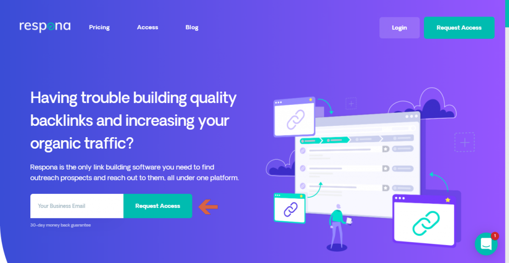 You can certainly have more than one CTA button on your landing page. But make sure that the call to action is the same. If you’re asking them for their email address, don’t shift to “Try our product now” on the next one.
Choose your preferred template
You have two options here — you can either start with a template before writing the headlines and the content or write the content first and choose a template. The advantage of choosing a template first is that you would have a clear picture of the outcome (what the landing page would look like). On the other hand, choosing the template last would give you more freedom. But you may have to add more elements to the template. Since you’re probably still starting out, let’s go with choosing a template first. Luckily, all the platforms have ready-made templates where all you have to do is supply the information. If you’re using WordPress, you can simply start with your default page template and hide the sidebar. Elementor has nice templates you can use (and even if you’re using Gutenberg, you can still pattern the page after the templates here). Of course, you can always build your own landing page from scratch. This is no problem especially if you’re familiar with building web pages (and it’s not really that hard to do once you’ve nailed down the basics). Just remember to include all the elements that will be mentioned after this section.Make your efforts count
A landing page has only one purpose — to convert your visitors. This is the bridge your visitors have to pass before they buy your product, sign up for a free trial, or provide you with their email address. Fortunately, creating a landing page isn’t rocket science. It doesn’t have to be complicated (or even costly). If you’re not confident with your copywriting skills, you can easily ask for help from a copywriter to make your copy compelling and engaging. If you’re already using WordPress for your website, then you could simply use it to create a landing page easily — just like how you would create any other page on your website. You can use the free Gutenberg builder or paid plugins like Elementor or Divi builder. Right now, z.com has an amazing web hosting offer for just a hundred pesos per month. That’s all you have to spend — nothing more, nothing less — to be able to start a website and create your own landing page. In summary, all you have to do to create an awesome landing page is… 1. Know your target audience by creating buyer personas. 2. Define the desired outcome and make it flow through your landing page copy and call to action. 3. Research the “right” keywords so your target audience would be able to find your landing page when they use a search engine like Google. 4. Start with a ready-made-template and simply change the images, headline, subheader, copy, and call to action. 5. Impress your visitor with a compelling headline. 6. Expound your headline with a subheader. 7. Grab your visitor’s attention with high-quality, relevant images. 8. Persuade your visitors with your copy. 9. Validate the offer of your landing page by showing testimonials and other social proof. 10. Invite your customers using a call to action. That’s it! Start creating your landing page with the steps outlined above and watch your visitors slide through your copy and respond to your call to action.
PROMO
FREE Web Hosting
for Your Website
Learn More